
A SaaS confirmation email is an essential part of user onboarding. Imagine you place an order and do not receive a confirmation email, you will feel post-purchase anxiety.
The SaaS email confirmation page is the first time a user interacts with a SaaS platform. Apart from being a confirmation, it gives users a smooth and reliable experience.
In this blog, we will provide email confirmation page examples, microcopy tips, conversion tactics and real-world examples that have done it the right way.
30-Second Summary
During the SaaS onboarding process, it is necessary to understand the importance of the SaaS email confirmation page. This page verifies the email addresses of users and ensures that there are no spam or fake signups.
The result of focusing on this page provides increased user engagement and reduced drop-offs. But how can you make an effective email confirmation page? This blog is the answer. It outlines a checklist of elements you need to include on this page, common mistakes to avoid, template examples and more.
What is a SaaS Email Confirmation Page?
When anyone signs up on a SaaS platform or creates an account, they get a confirmation email. This email has a link. When they click on the link, it takes them to a landing page. That landing page is the SaaS email confirmation page.
This page verifies the user’s email address, has instructions on what to do next and additional information about the SaaS service or the product.
For example, a SaaS company sends a confirmation email to the user who signed up. This email will verify their email address and have instructions, such as “go to the dashboard.” It will also invite users to log in and start using the platform.
Why is the SaaS Email Confirmation Page Important?
The SaaS email confirmation page is a bridge between user registration and them becoming an active customer. If this page is not well-optimized, it may result in a bad user experience.
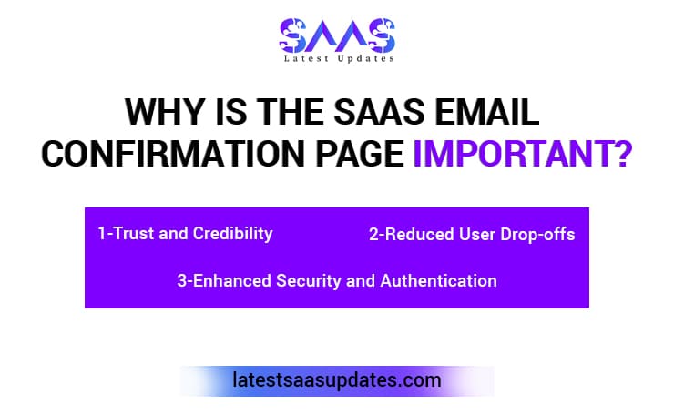
Trust and Credibility
A professional email page builds users’ trust. When you provide a clear message to your users about why email verification is needed, it enhances your credibility. It is important to show that your users’ information is in safe hands.
Some things you should not ignore when creating a SaaS email confirmation page are consistent colors, brand logo and sleek typography. It reinforces a trustworthy image and clears all doubts.
Reduced User Drop-offs
An unclear confirmation process makes users confused and frustrated. Such SaaS businesses suffer an increased abandonment rate.
Therefore, it is important to streamline this process. The steps should be minimal with clear instructions. This approach will lead to increased completion rates and speed up the onboarding process.
Enhanced Security and Authentication
SaaS email confirmation also creates an extra layer of protection. You can prevent fake user signups and malicious registrations.
Having this email confirmation page ensures subsequent emails, service updates and notifications reach all the users.
A Checklist for an Actionable SaaS Email Confirmation Page
- Clear success message of account set up or after a purchase.
- Call to action (CTA) to the next step
- Mobile accessibility optimization
- Concise and helpful microcopy
- A resend email button
- Personalized touch
- Tracking with effective analytical tools
- A/B testing with different layouts and messages
UX Principles for an Effective Confirmation Page
Having a clear confirmation message, a prominent CTA and additional information are the email confirmation page UX elements. These are used to guide a user, improving their experience.
Clear and Concise Confirmation Message
Having a clear confirmation message does not leave any doubt for users. It immediately tells them that their email is verified.
You should use simple and positive language to avoid ambiguity. For example, “Your email is confirmed” or “You are all set.” Moreover, do not use jargon or technical terms to avoid confusion.
Prominent Call to Action (CTA)
A prominent CTA tells users what to do after email verification. Common CTAs you can include on your SaaS email confirmation page are,
- “Log in” to access the application.
- “Start Exploring” to encourage them to use the product.
- “Go to Dashboard” to guide them to their account area.
The CTA should be visually prominent and easy to find.
Visual Hierarchy and Design
Visual hierarchy and design are important to bring attention to the important messages on the confirmation page. For example, highlighting the CTA and making the confirmation message bold makes them stand out.
A clean and uncluttered design makes the page easy to scan. You can use a checkmark or other similar visual confirmation elements.
Mobile Responsiveness and Fast Load Times
Every user checks their emails on mobiles nowadays. If your SaaS email confirmation page is not responsive or lags, it may break the trust of users in your services.
Moreover, slow loading can interrupt the flow. Users prefer pages that load fast. It keeps them engaged, increasing user experience.
Innovative Features to Include in SaaS Email Confirmation Page
Apart from basic design elements, you can add the following features to improve user experience.
Progress Indicators: If your registration process has multiple steps, include a bar or step indicator to provide clarity to users.
Interactive Elements: Add interactive features, such as a countdown email expiration counter or chatbot for 24/7 support.
Alternative Login Options: Streamline the process by allowing people to log in with their social media accounts or other alternative options.
Timer-Based Incentives: Use features, such as discounts and freebies. It encourages users to complete their registration quickly.
Multi-lingual Customer Support: You can cater to users worldwide by providing the SaaS email confirmation page in multiple languages.
Microcopy Tips for Better Engagement
Microcopy is often overlooked on the SaaS email confirmation page. However, it can either reassure your users or frustrate them. Not having a clear microcopy tends to make your customers feel confused. Therefore, it is necessary to guide them with concise and clear sentences.
Let’s see how to write the perfect microcopy.
- You should not use a robotic tone, “Your email has been confirmed.” Humanize your message.
- Be clear about the next steps, “Click below to explore our products.”
- Add the element of reassurance, “Didn’t get the email? Resend it.”
- Make sure to reinforce the value, “Use the tool trusted by 10,000+ teams.”
Confirmation Page Microcopy Elements
The following are the essential components of a SaaS email confirmation page microcopy.
Headlines and Subheadings: The headlines should be clear and engaging to guide users.
Button Copy: Make your CTA (call-to-action) buttons clear and actionable.
Error Messages: The error messages should clearly state the issue and guide users toward the solution.
SaaS Email Confirmation Page Template
When you are creating your own template, make sure to include the following elements.
- A clear subject line
- Friendly yet concise greeting
- Summary of actions (signups, reservations, purchases or subscriptions)
- Clear CTA
- Consistent branding
- Helpful resources (contact information or link to knowledge base)
- A thank you message for the user
SaaS Email Templates
- Minimalist Template
Success! Your email has been confirmed.
Start using the app now.
Didn’t get redirected? Click Here.
- Personalized Template
Welcome to (SaaS name), Sarah!
You are all set. Let’s get started.
Click Here to go to Dashboard.
Need help? Contact our team.
- Value-Based Template
Welcome to (SaaS name).
Congrats! You’ve unlocked your workspace.
Ready to explore how (SaaS name) can help you solve (X problem?)
Take a Tour now!
SaaS Email Confirmation Page Example
Below are some examples of SaaS onboarding email templates and confirmation pages.
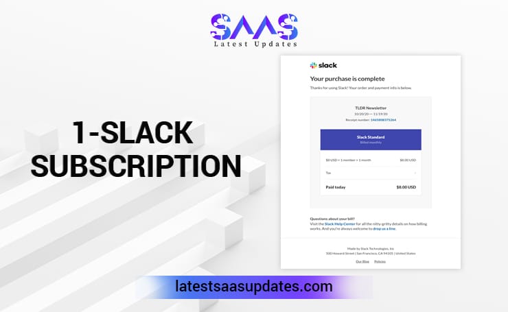
- Slack Subscription
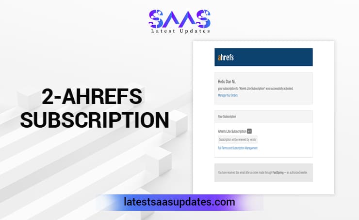
- Ahrefs Subscription
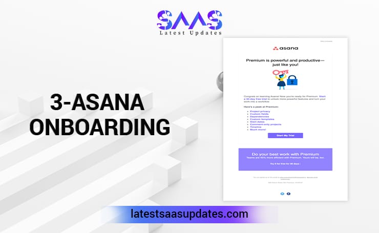
- Asana Onboarding
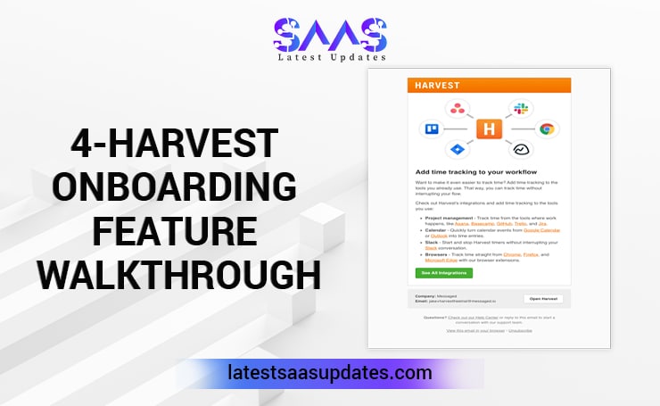
- Harvest Onboarding Feature Walkthrough
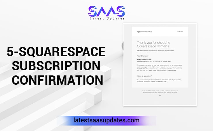
- Squarespace Subscription Confirmation
Free SaaS Email Confirmation Page Template Websites
Several websites provide SaaS email confirmation page samples. You can choose from the variety and customize it for your business. These emails are for every step, including subscriptions, onboarding and transactional emails.
Some of these websites are,
Unlayer: This website has over 1000 templates. The drag-and-drop feature allows easy customization. You can integrate it with other email service providers. You can create custom blocks for future use and get instant feedback to improve your designs.
Tabular Email: You can get free SaaS email templates. It has a drag-and-drop builder. You can customize the templates for various emails, including marketing, transactional and onboarding. Moreover, it offers multiple downloadable HTML email templates.
MailerSend: This platform offers a drag-and-drop editor. You can easily customize the templates. These templates have IDs, which you can monitor on your dashboard after sending the email to users.
WriteSonic: This platform has more than 100 customizable email templates. These templates include account confirmation, onboarding and much more.
Stripo: You can find a variety of free email templates for SaaS businesses. It also has a drag-and-drop editor to make the customization process easy.
Designmodo: This website has free order confirmation HTML email templates. You can add different design elements and use various customization options.
Beefree: You can use this platform to create professional emails. This platform allows you to customize colors, fonts, images and layouts.
Common Mistakes to Avoid
You need to steer clear of the following pitfalls while designing your SaaS email confirmation page.
- Avoid overloading your page with information. It can look cluttered and confuse users.
- Do not use distracting visuals. A clean and focused layout is excellent for guiding users.
- Do not leave your CTA vague. It can cause frustration for users and increase bounce rates.
- Not having contact information can make users feel stuck and dissatisfied. Therefore, always include support options.
SaaS Email Confirmation Page Best Practices
These tips will help you reduce fake signups and improve conversions significantly.
Preventing Fake Signups
- Integrate disposable email detection SaaS platforms. They identify and block users who attempt to create accounts using temporary or disposable email addresses.
- Always use CAPTCHA and reCAPTCHA on signup forms to prevent malicious activities, including fake signups and spam.
- Set expiration time on the confirmation page. It limits the time window to prevent email exploitation. Additionally, users get a sense of urgency and complete their onboarding process. It reduces the abandonment rate of signups.
Boosting Onboarding
- Highlight the product’s characteristics and include onboarding tips. It guides users on how to use the product and improves engagement.
- Use clear calls to action. Phrases such as “Customize your profile now” or “Start using the app” tells users what to do. This approach provides positive experience and drives further user engagement.
Tracking Engagement
- You should track drop-offs after the confirmation process. It is necessary to see at which point users are leaving the onboarding process. You can target and improve those areas for better conversions.
- Analyze event-based user engagement. When you track specific events, such as link clicks, time on page and CTA interactions, you can pinpoint areas of improvement.
Real World Examples of SaaS Email Confirmation Page
Have a look at some companies that set immaculate email SaaS confirmation pages.
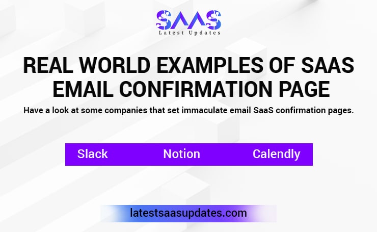
Slack: The confirmation flow of Slack is excellent. After you confirm your email, you land directly on the page that guides you on how to set up your workspace. The microcopy and CTA are clear and direct.
Notion: On Notion’s confirmation page, you find helpful onboarding tips. These tips include inviting your teammates and importing content. These tips make your next steps effortless.
Calendly: Calendly focuses on providing a seamless experience. It has a link to a quick-start guide for users. It shows them if they are on the right track.
The Bottom Line
In the entire SaaS onboarding process, the email confirmation page may get overlooked. However, it is essential for user engagement and reducing bounce rate.
To create a successful SaaS email confirmation page, you need to include various elements, such as microcopy, consistent branding and clear CTAs.
This blog discussed these aspects in detail. Improve user experience through this guide for your business and thrive in the SaaS industry. Visit Latest SaaS Updates to learn more about this domain.
FAQs
What is a SaaS Email Confirmation Page?
This email confirmation page shows up when a person signs up for a SaaS product. It opens up when a person clicks on the link sent to them through email. It verifies the user’s email and has the next steps for onboarding.
Is a SaaS Email Confirmation Page Important?
Yes, a SaaS email confirmation page is necessary for the user onboarding process. It prevents any fake signups, verifies users’ emails and provides insights about the product. Moreover, a well-designed page improves user experience and reduces drop-off rates.
What are some Email Confirmation Page Call to Action examples?
Some general examples you can include on your email confirmation page are: “Start your free trial today”, “Download the app”, “Activate your account”, “Sign up now and save,” and “Claim your free trial before it expires.”
Can the Email Confirmation Page affect the conversion rate?
Yes, a dull and directionless confirmation page makes users abandon the onboarding process. A clear and seamless page with every necessary element engages users and makes them explore your page.